
Experiment: Shooting art with cheap lenses
Analog to digital conversion
A dear reader asked if the Canon 40mm 2.8 pancake is any good for shooting paintings. While I figured that it would be, I decided to compare the 40mm to the 50mm 1.8 and the 18-55mm kit lens to see which one would be more suitable. Please read on for the 3 test shots - 1 will shock you and blow your mind! Not. ;)
What are we looking for?
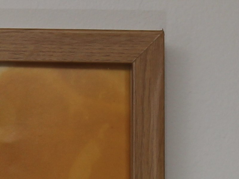
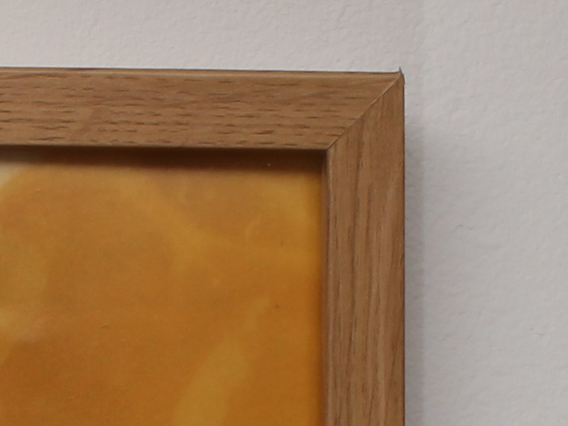
In order to shoot a painting - or a framed picture in this case - the lens should have very little distortion or the paiting will look awkwardly bent. Also, we want good sharpness all the way out to the edges.
While not the primary focus of this article, lighting is a quite big issue. You will want even lighting and also avoid reflections. Two or more soft boxes would be useful, or two or more strobes. However, I have only one strobe and that will create some unwanted shadows as we will see. :(
Setup
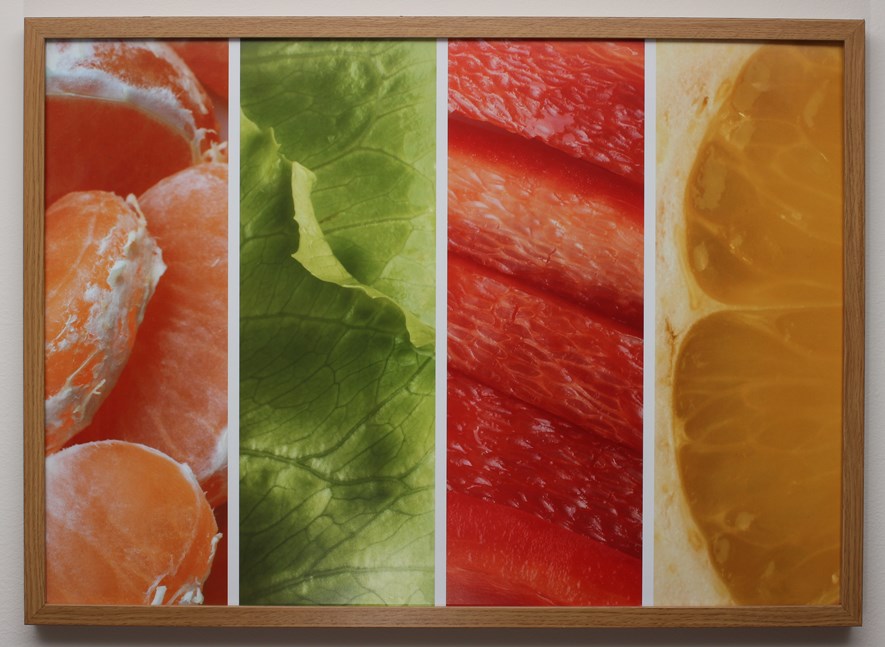
A framed poster will serve as subject. It measures 72x52 cm and hangs on a wall. To make sure the picture looks flat, the camera should be at the exact same height as the center of the picture - a tripod is great here. We will use a flash and bounce agains the ceiling to get controllable, even lighting.
The camera is a Canon 600D (crop sensor camera). Aperture is set to f/11 for all lenses for good sharpness, shutter speed is 1/200th and ISO set to 100. The small aperture, fast shutter speed and low ISO will make sure to keep unwanted ambient lighting and reflections to a minimum.
The results
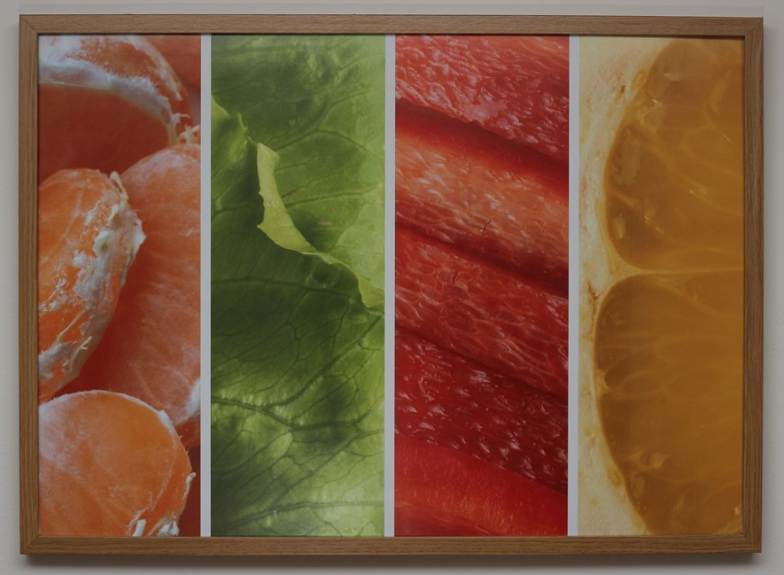
Canon 18-55mm kit lens @55mm
Shot around 2.5 meters from the subject.
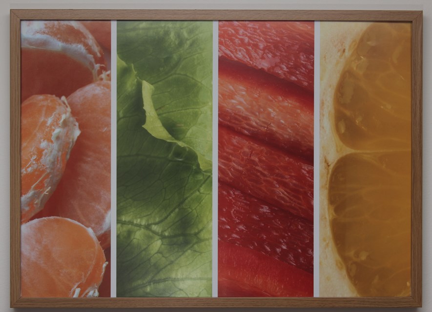
Canon 50 mm 1.8
Shot around 2.5 meters from the subject.
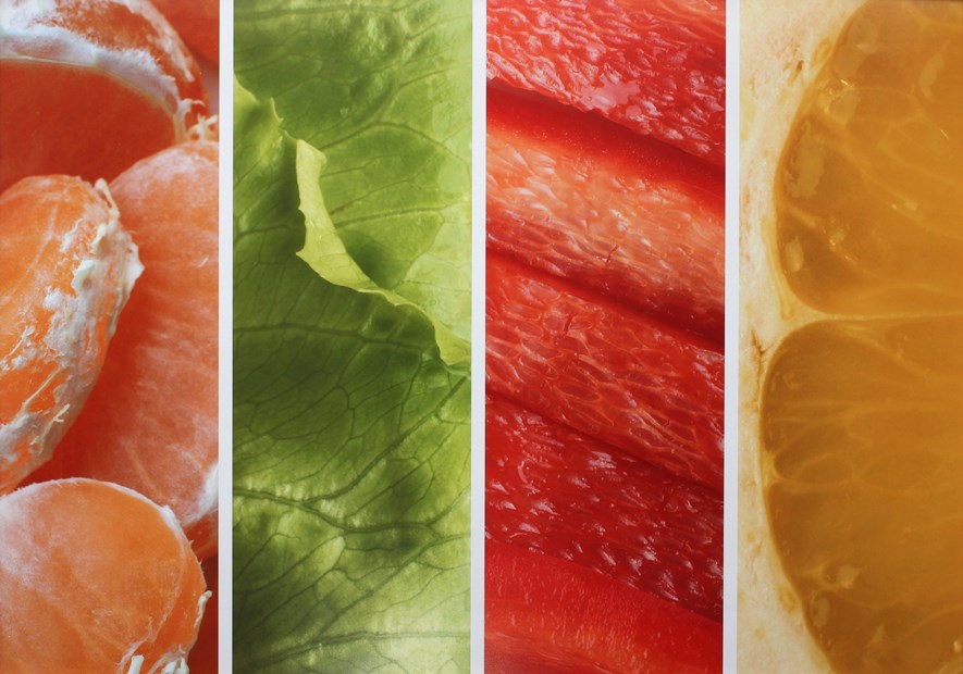
Canon 40 mm 2.8
Shot around 2 meters from the subject.
All three at once
Don't we all love animated gifs? Anyway, it should help some in comparing the distortion.
Conclusion
Both the 40mm and 50mm seem to be up for the job sharpness-wise, with the 50mm having slightly less distortion and the 40mm providing slighty more vibrant colors (in my case). So basically a toss-up. Also, Photoshop has filters for reducing distortion, which you might want to look into.
However, even lighting is critical, and I felt the lighting in my setup was not quite good enough. Another flash or a couple of soft boxes should help here.
0 Comments
Subscribe to new comments by RSS